Interactive maps are responsive on desktop and mobile browsers
A responsive map automatically adjusts to look its best on whatever device it is displayed on: desktop, tablet, or phone. As you make the browser narrower or wider, the map becomes smaller or larger. You don’t need to do anything to make your interactive maps, diagrams, and images responsive because MapsAlive makes them responsive automatically.
Responsive map in a Classic tour on a desktop browser
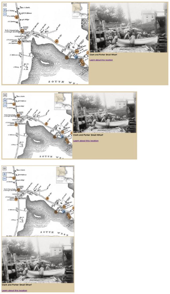
The screenshots below show what a Classic tour looks like as a desktop browser gets narrower. Notice how the tour maintains its aspect ratio (the shape as a ratio of its width to its height) as the tour gets smaller. When the browser becomes so narrow that the map, image, and text would be squished, the tour automatically switches to a stacked layout where the map, image, and text are in a column. The stacked layout allows the map, image, and text to be larger than in the original layout.

Classic or Flex Map tour on a mobile browser
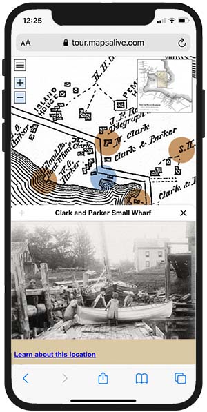
The Classic tour above is shown below running in mobile mode on a phone. A Flex Map tour would look the same because mobile mode works the same way for both kinds of tours.

Responsive map in a Flex Map tour on a desktop browser
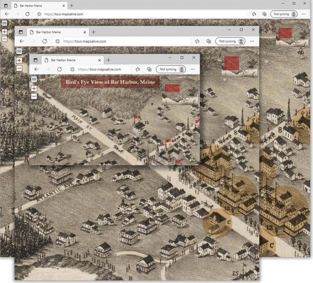
A Flex Map tour automatically scales to fill the available browser area as shown in the screenshots below. As you make the browser larger or smaller, the map scales up or down, which in turn, automatically adjusts the zoom level. This feature ensures that the map always looks its best at any browser or device size and orientation.

The historic map image above comes from the Boston Public Library.
