Maps behave like apps on small mobile devices
MapsAlive’s unique mobile mode feature is automatically enabled for an interactive map on a small mobile device like a phone or smaller tablet. This feature makes a map behave like a mobile app by using as much of the available screen area as possible on small devices.
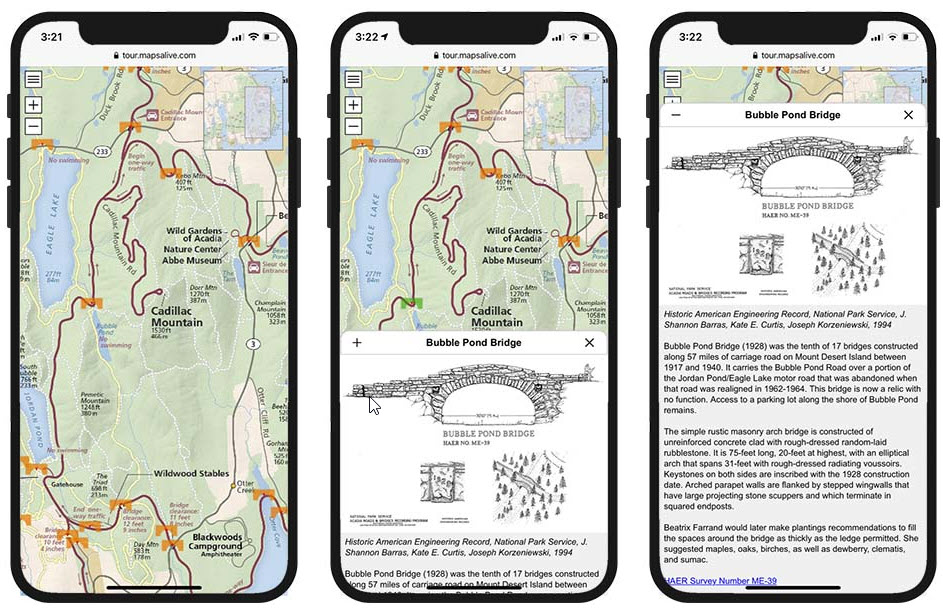
The screenshots below show how the map uses all of the available screen space. When you touch a marker, a slideout panel appears to display part of the marker’s hotspot content. Touching on the + expands the panel to show more content. When you close the panel, the entire map is visible again. If the slideout would cover the marker you touched, the map automatically pans to keep the marker visible.

Mobile Mode Advantages
Mobile mode makes a tour look and behave much like a mobile app even though the tour is running in a browser. Mobile mode provides the benefits of a mobile app user interface, but people don’t have to download and install an app to use your tour.
Like a mobile app, mobile mode uses all of the available screen area to display the map in both portrait and landscape orientation. By using the entire screen, mobile mode makes even large, detailed maps, truly useful even on small devices.
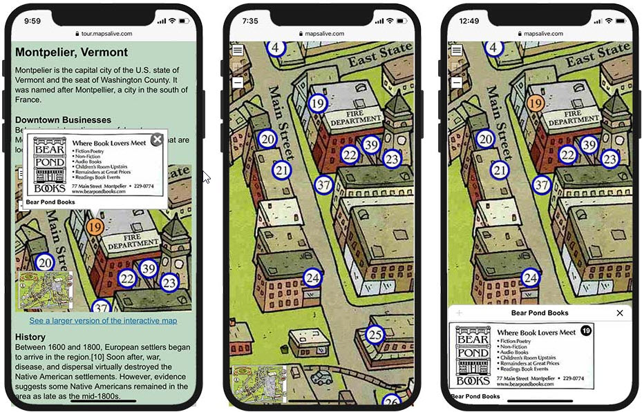
The screenshots below show a tour that is embedded in a web page and not in mobile mode (left), in mobile mode with no slideout (middle), and in mobile mode (right) with a short slideout that does not expand because the image is small and there is no additional content.

As you can see from the example above, the difference in appearance and usability between an embedded tour, which runs in desktop mode, and a tour running like a mobile app in mobile mode, is dramatic.
